ABOUT THE PROJECT
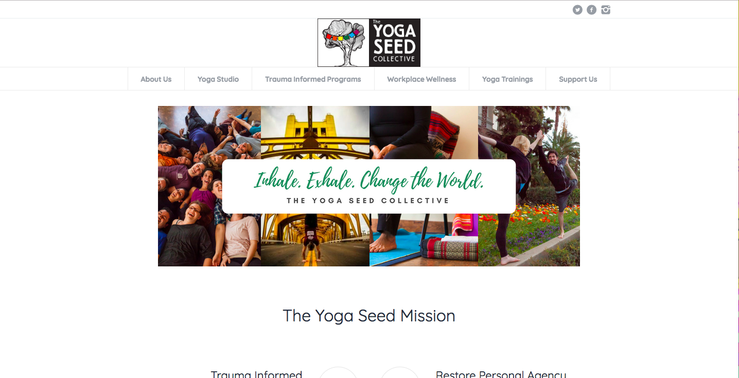
When I first looked at the old site for The Yoga Seed Collective, I couldn’t find anything. Links were broken, information was buried in piles of text, content was outdated or missing, and the aesthetic of the old site didn’t reflect how they wanted to present themselves.
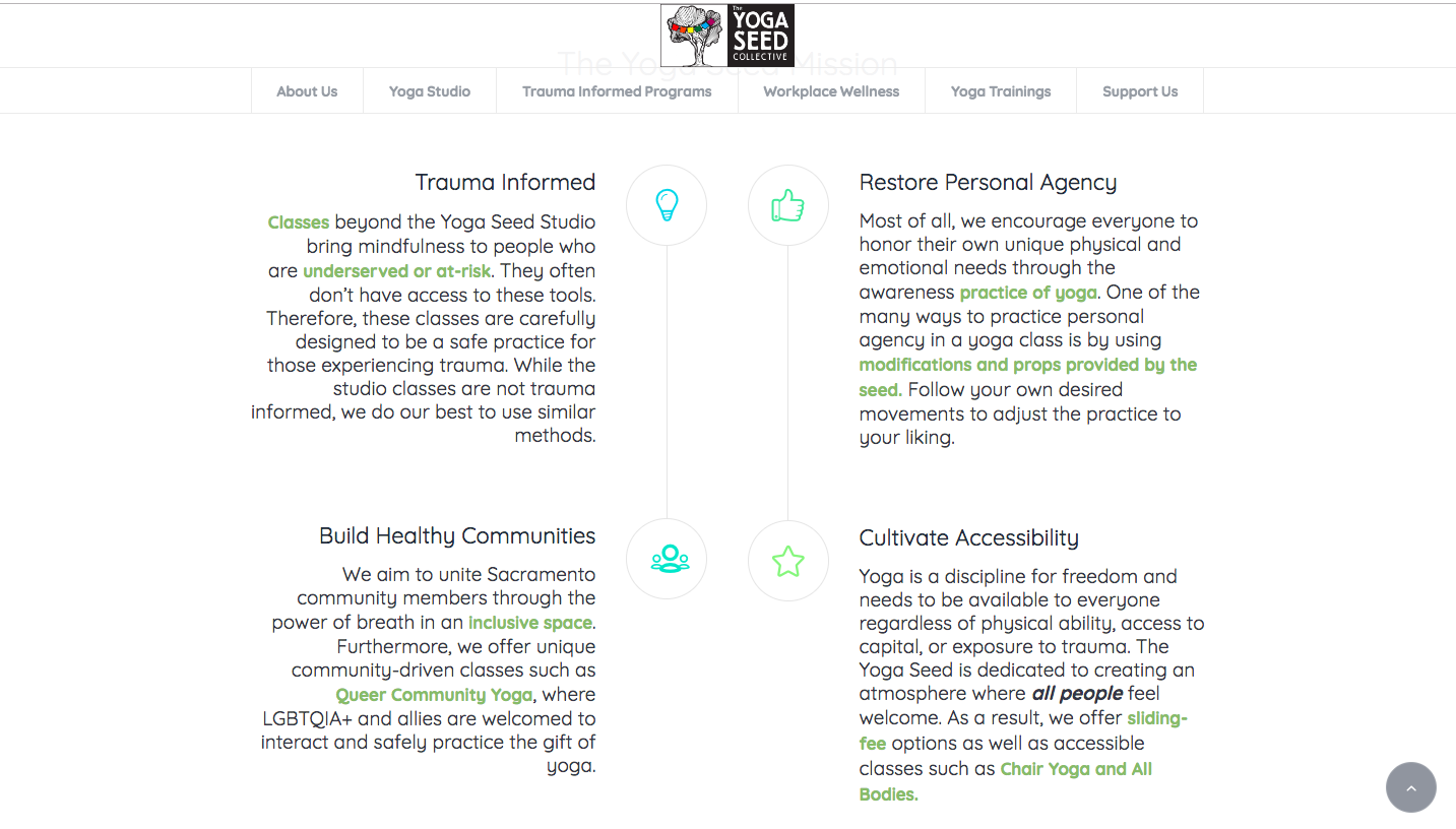
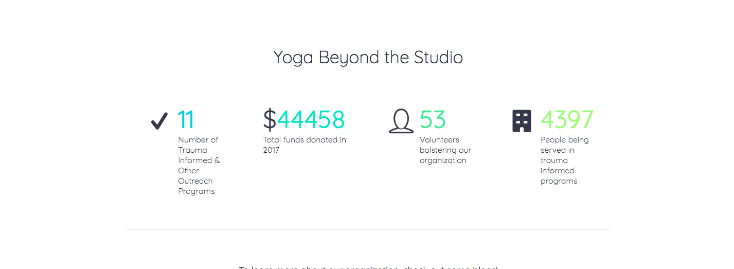
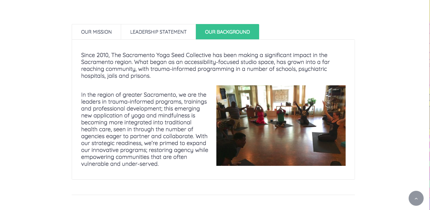
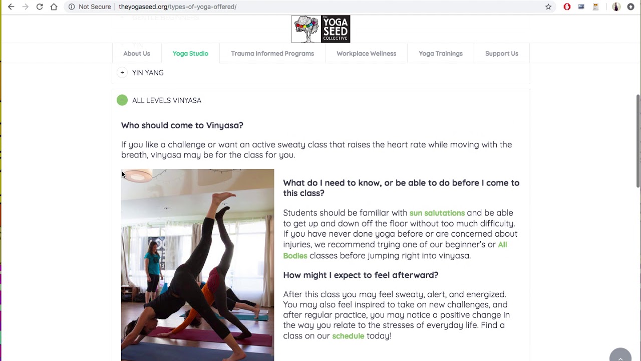
I sat down with the marketing director and we hashed out a vision. They wanted the site to be much cleaner and simpler than their old one. This required, first and foremost, content editing. I copy and pasted every single last word (are trust me there were many) and got to editing and adding content. The result is easy-to digest information that’s simple to find and straight to the point.
All of the design – aesthetically or otherwise – was done by me, but with careful consideration of the Yoga Seed’s mission and brand. This is one of my largest projects I’ve ever done and I happily continue to maintain their site and make any updates needed.
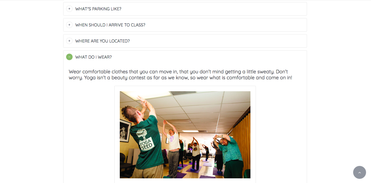
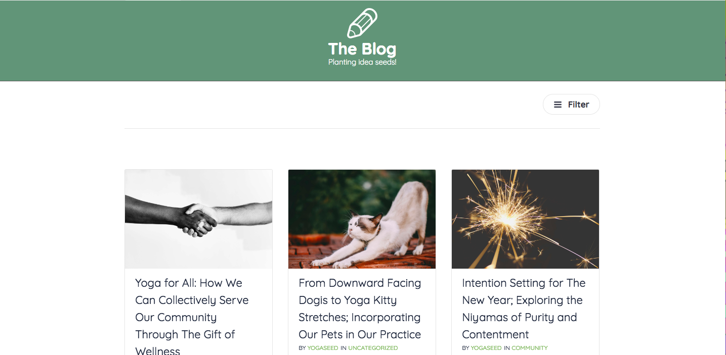
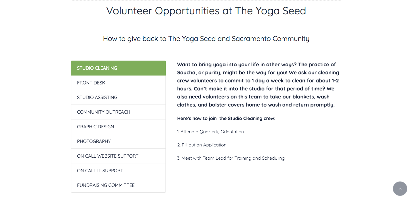
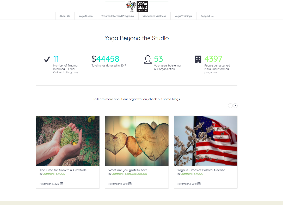
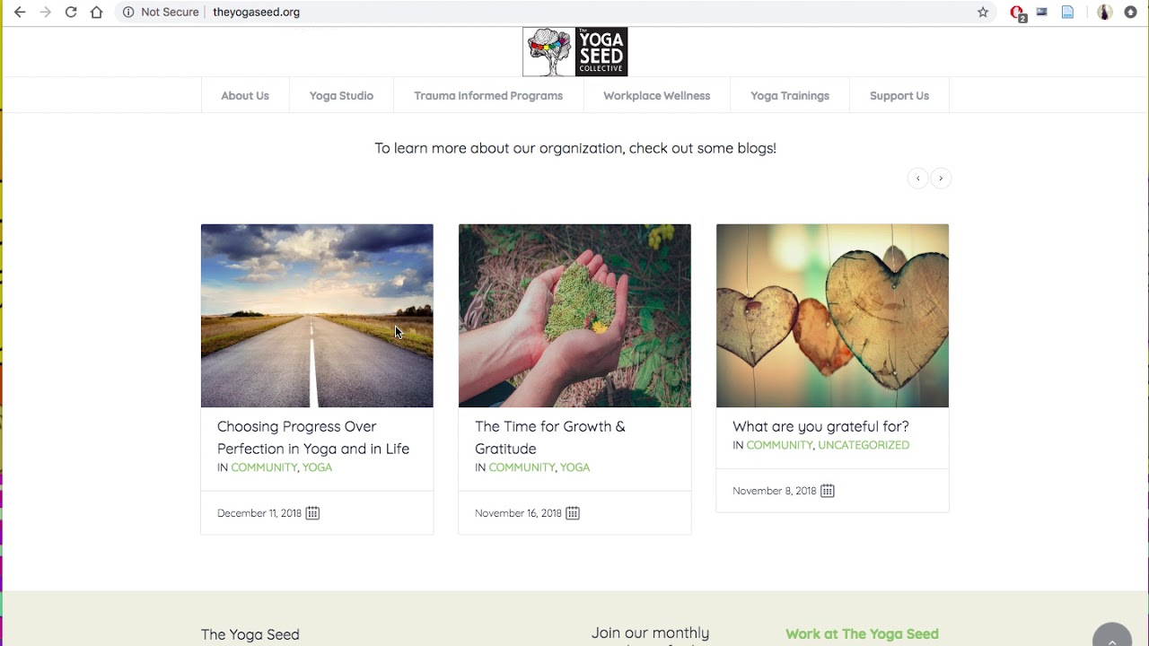
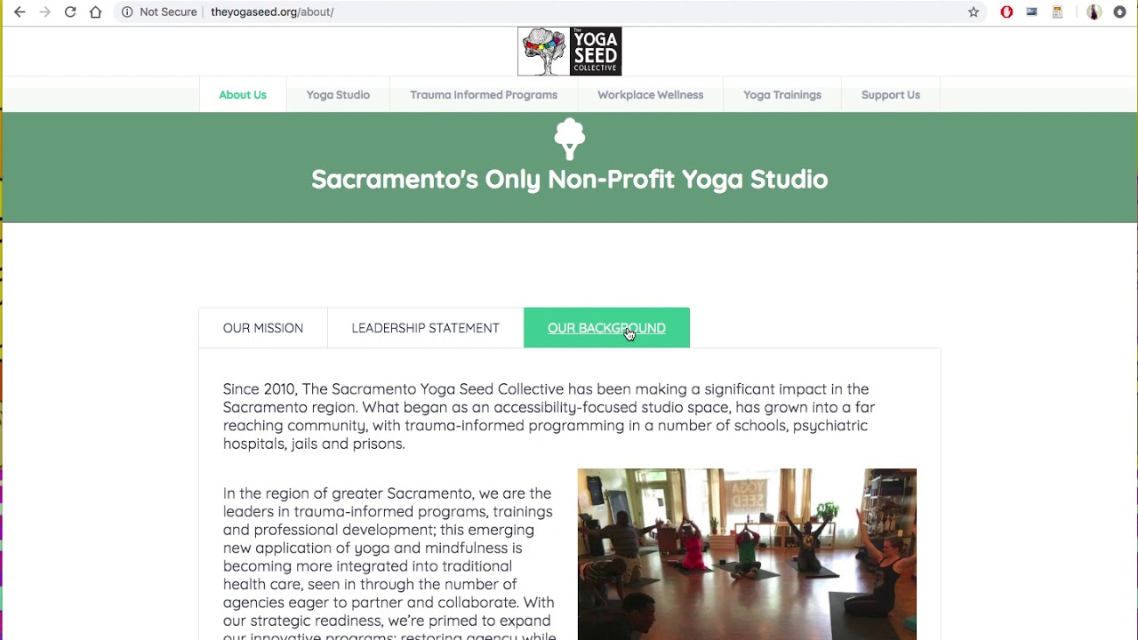
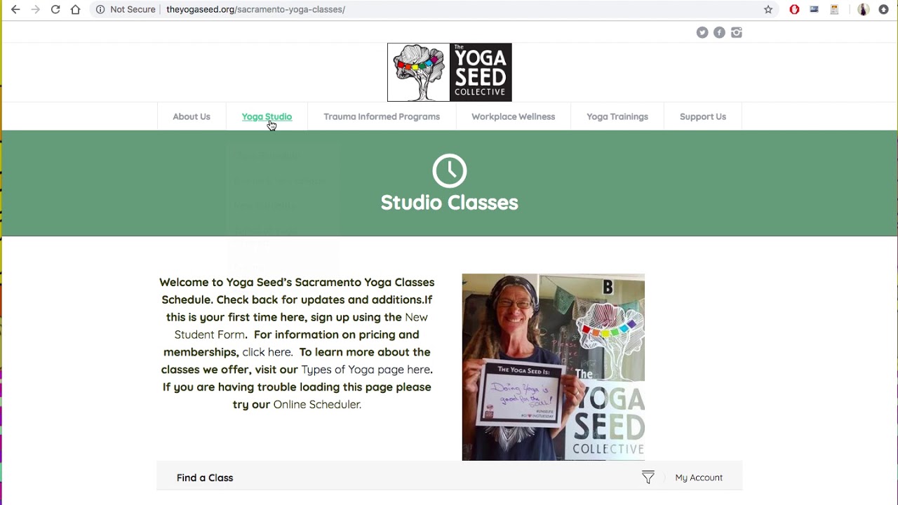
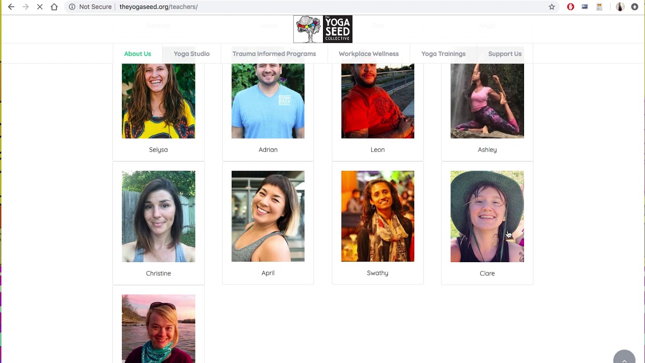
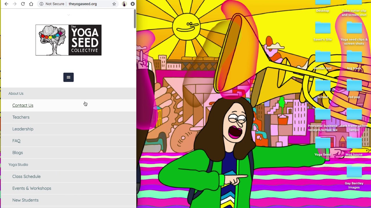
View the images and screen videos below or go directly to their website.
UPDATE: The site has been altered since my design, please refer to the images/videos for the original work.
THE PROCESS
1. Planning and Research
Created a branding and organizational vision and researched color schemes, plugins, competitors’ sites, etc.. Then listed a plan of action and consulted with the marketing team.
2. Content Editing and Arranging
Re-wrote, copy-enriched, and edited existing content. Arranged content according to what would be on what page. Also sifted through hundreds of photos and organized those
3. Website Layout Design & Function
Made crucial decisions about not only the aesthetic of the site, but also the functions, CTA buttons, image placement, plugins, widgets, you name it.
4. Launch and SEO
Placed keywords throughout the site in an intentional manner, as well as basic SEO work such as alt tags and meta descriptions.
5. Ongoing Maintenance
I currently update the site regularly when changes are needed, and will be assisting with a new SEO project in the works.

