ABOUT THE PROJECT


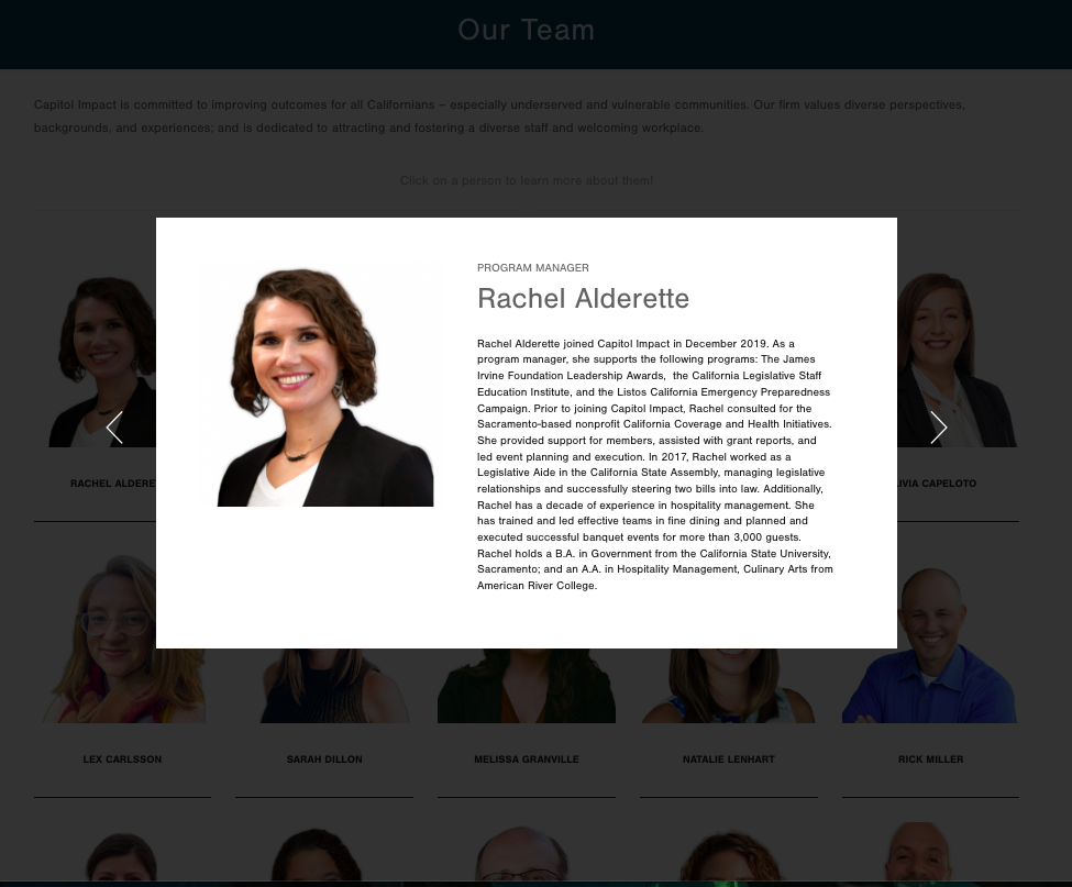
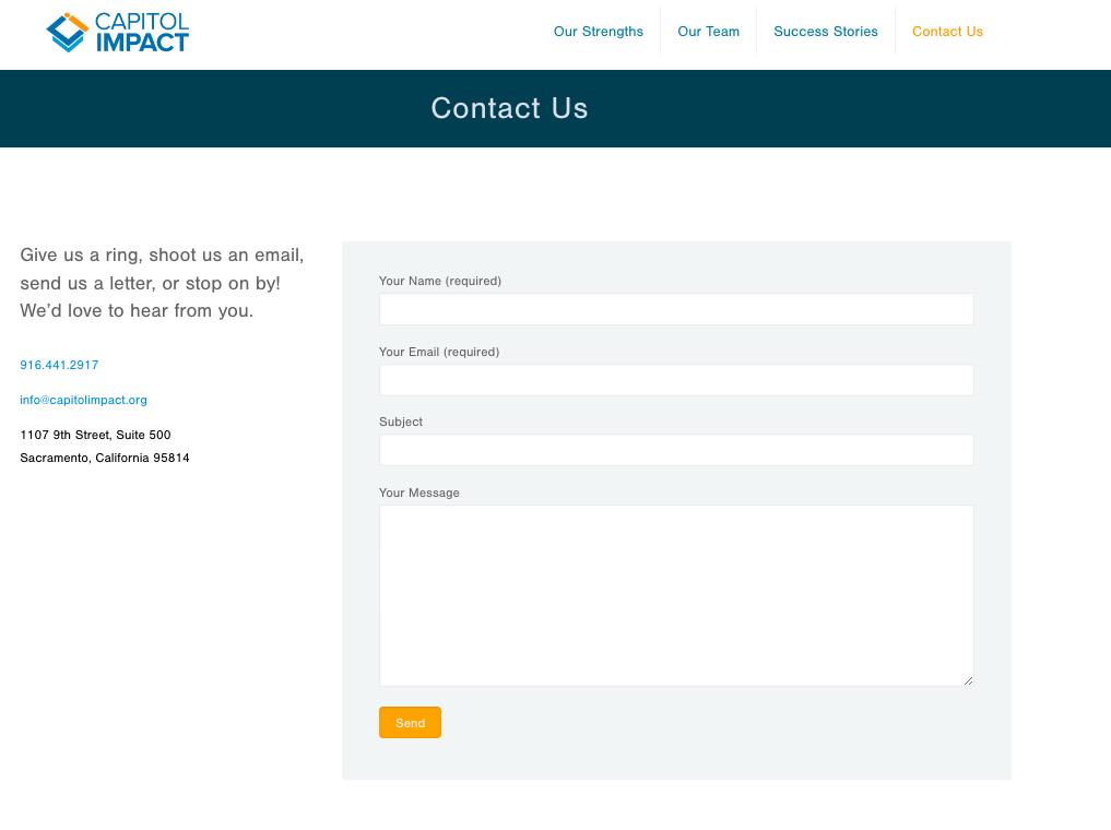
I had the privilege of working with Capitol Impact after working with their “sister” organization, CORE. Like CORE, they didn’t want a complete overhaul of the site, but rather some tweaks here and there to make the site more organized and pleasant to look at. Little things make a huge difference, such as a contact form, color header banners, text organization and edits, a home page image, color blocked sections, team lightbox bios/team page, and more.
View the images below or go directly to their website.
THE PROCESS
1. Going over goals for audience engagement
Learning what they want site visitors to take away from their site as well as main changes they wanted done.
2. Page reorganization/editing
I re-structured their pages to flow better and be more comprehensible as well as made minor writing edits.
3. Design “face lift”
Without changing their theme too much, I did some redesigning including creating a staff page with lighbox bios, a background for header banners, new homepage structure, and making sure color themes are consistent throughout.


