ABOUT THE PROJECT


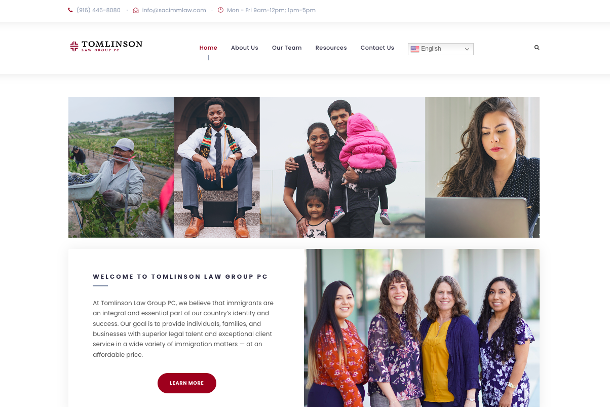
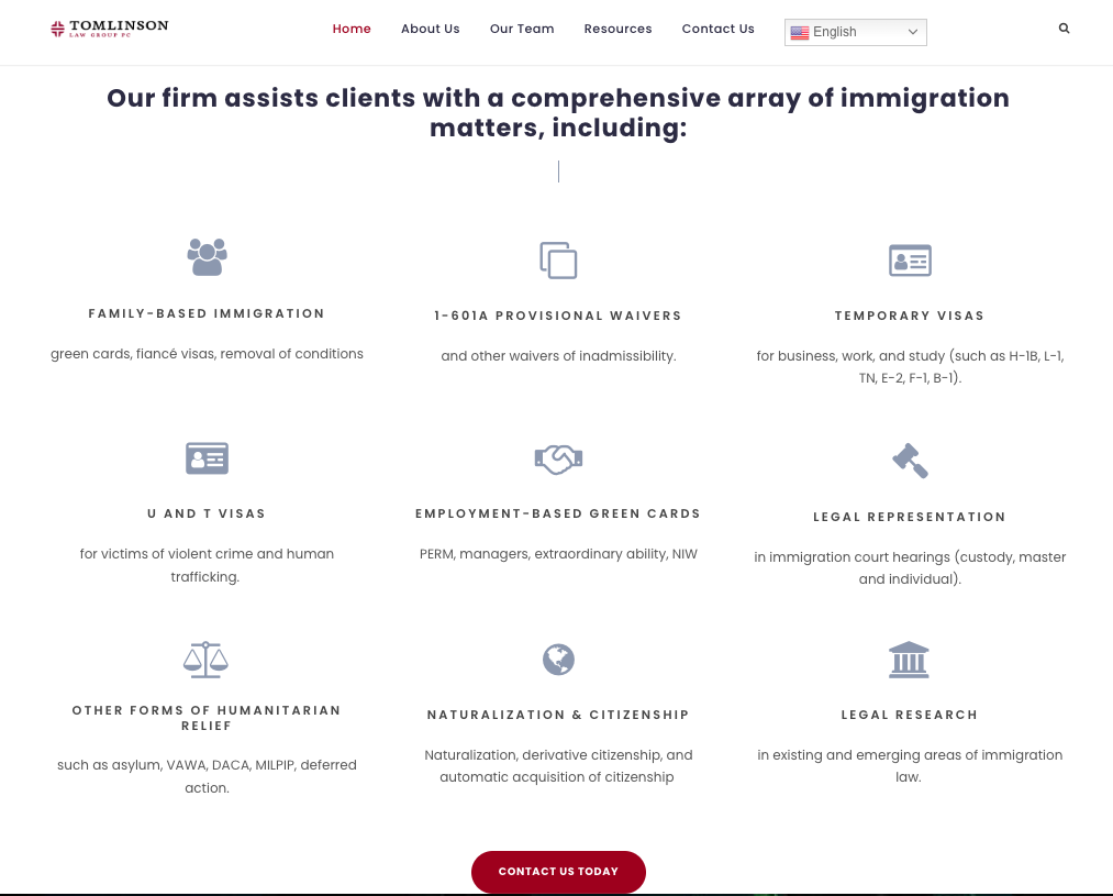
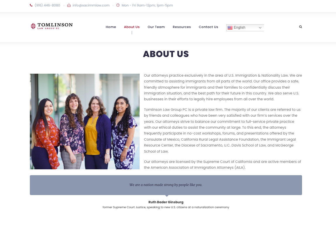
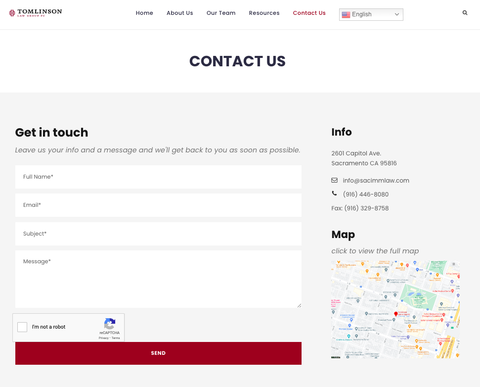
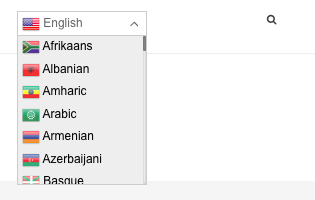
Although this is one of the more aesthetically simple sites I’ve designed, it’s amongst my favorites. I love making sites for a good cause, and to me helping people get their visas and other immigration legalese is well worth it. This was a complete bottom-to-top redesign that I’m super proud of. It’s clean, easy to navigate, the color scheme is amongst my favorites, and most importantly, the site is translatable.
View the images below or go directly to their website.
THE PROCESS
1. Creative Freedom
Lucky for me, the business owner pretty much gave me creative freedom on this project. The goal was clear: make this site easy to navigate, pleasant to look at, and thoroughly informational. I gave some design examples and palettes to choose from and we went from there!
2. Research & Planning
First, I decided on page structure and layout, clickfunnels, and collected all the info needed to create stunning Team Member profile pages. After doing lots of research on law firm websites and looking at various templates for inspiration, I was able to begin designing.
3. Design
Here’s where things come to life. Everything from button color choice to fonts to padding size was taken into consideration. I even scoured the internet for diverse images representative of the populations they serve for the image banner!
