ABOUT THE PROJECT


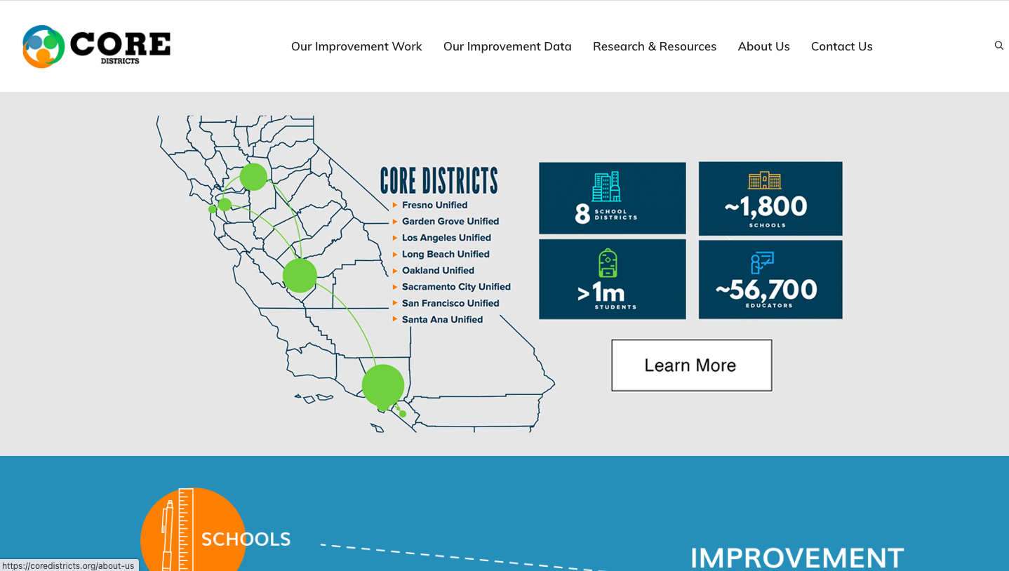
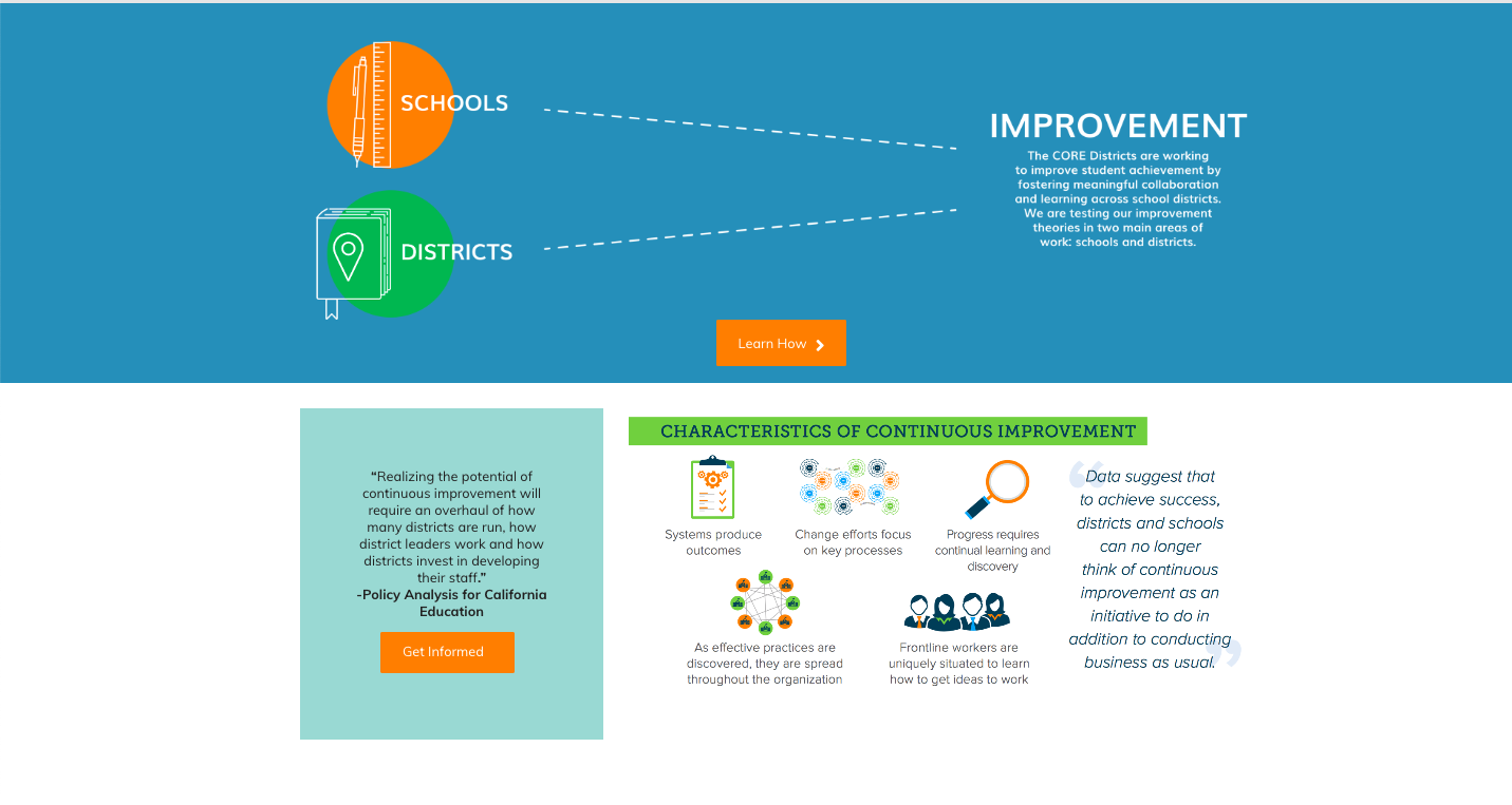
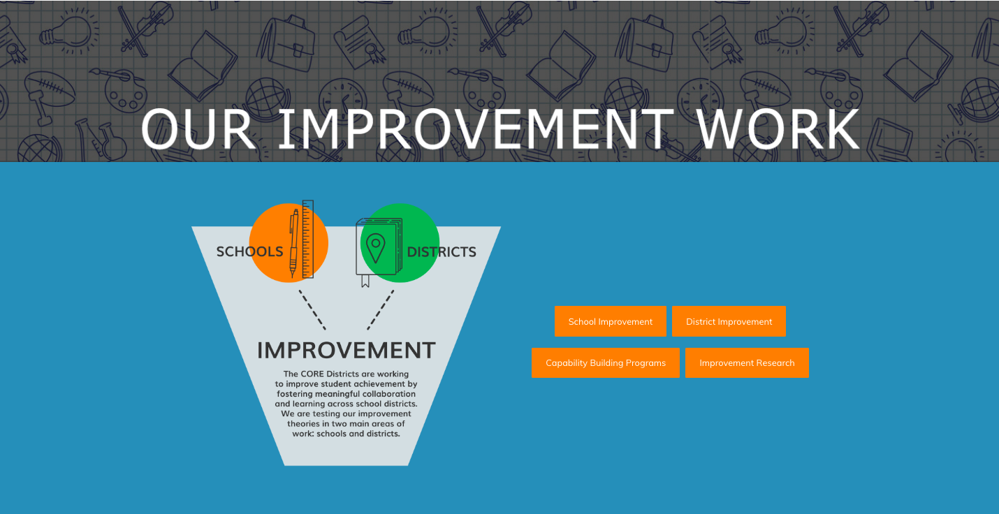
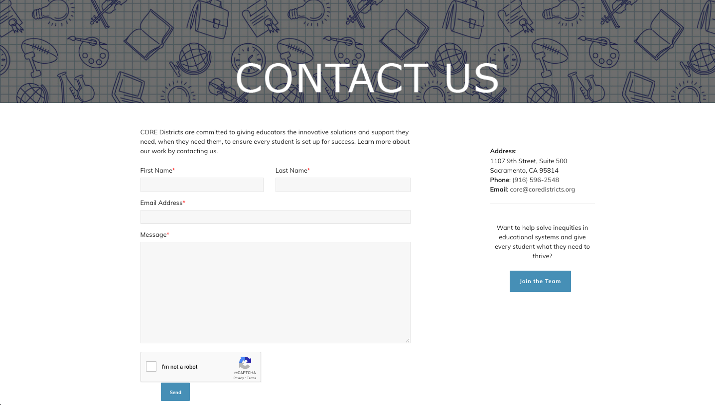
As you may have noticed by perusing my portfolio, my specialty is working with non-profits. I was lucky enough to help a great education organization, CORE Districts, clean up and elevate their site a bit. They originally had lots of information kind of everywhere on tons of pages. Our main goal was re-organizing and reimagining the click funnel and navigation, as well as adding buttons throughout to link to relevant pages. They wanted to keep more or less the same design, but with some upgrades, so that’s exactly what I did!
View the images below or go directly to their website.
THE PROCESS
1. Going over goals for audience engagement
We had a very productive meeting so that I better understood what they want site visitors to learn and take away from their site as well as main changes they wanted done.
2. Complete page/navigation reorganization
I re-structured their site entirely to flow better and be more comprehensible. Created new pages as needed.
3. Design “face lift”
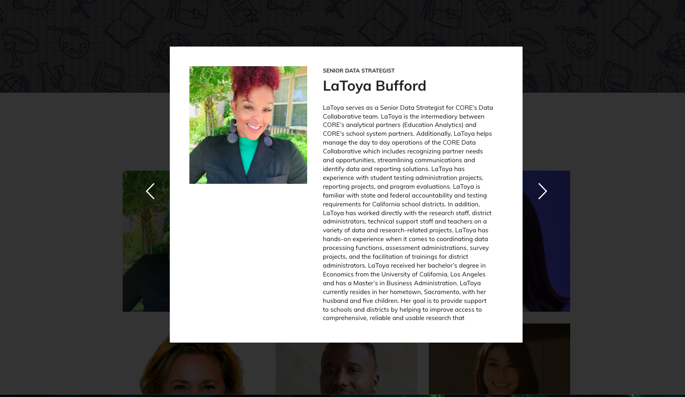
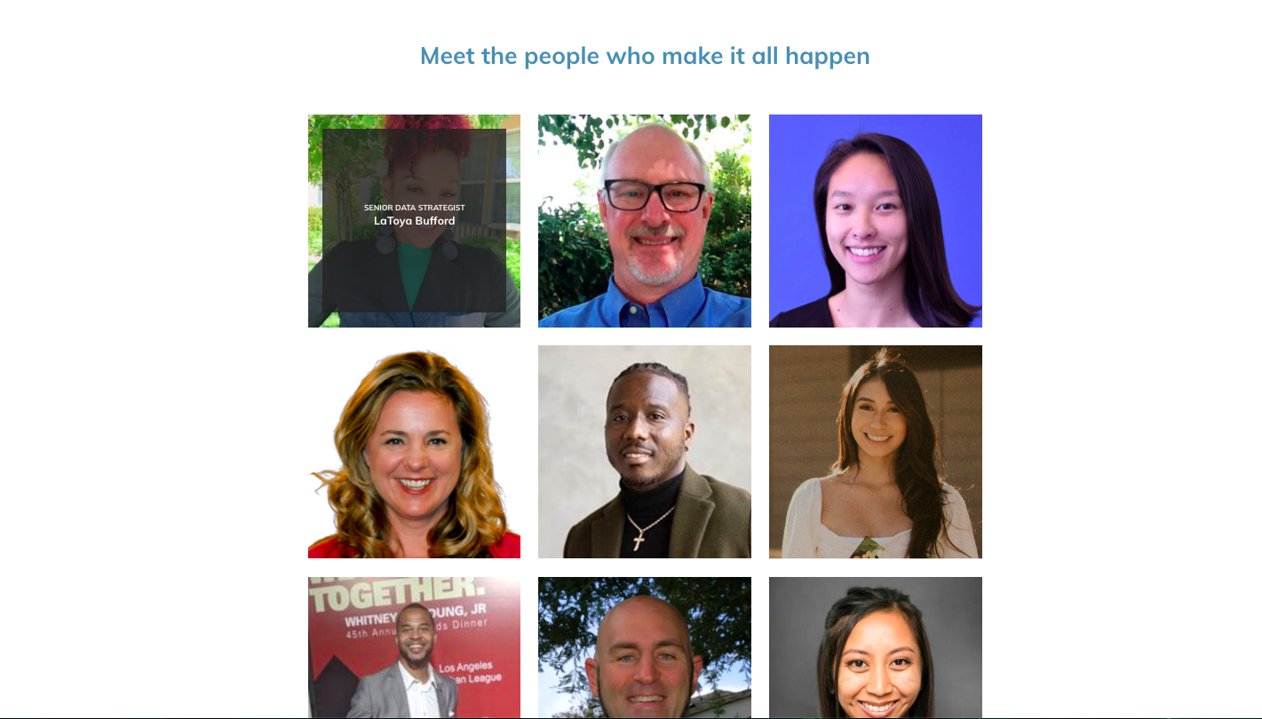
Without changing their theme too much, I did some redesigning including creating a staff page with lighbox bios, a background for header banners, new homepage structure, and making sure color themes are consistent throughout.
